
DIFFERENTIATION VS DISTINCTION
In today’s fiercely competitive world, companies often struggle to carve out an ownable niche, making it hard for brands to have any strong, unique selling point (USP). With every market labelled as oversaturated, differentiation has become rare, resulting in brands looking to create distinction to stand out.
Take GoCompare and Compare the Market, two titans in the comparison world. Neither brand has a USP, after all, they do the same thing. Compare prices to save you money. It’s a crowded marketplace where everyone is selling the same promise. So, how do they stand out? By creating a personality for the brand and a fictional, memorable narrative.
Imagine sitting in a room full of executives brainstorming how to jazz up a price comparison site. “What about meerkats with Russian accents?” someone suggests. Laughter fills the room, but someone – the visionary – says, “No, really.” And so, Compare the Market became synonymous with its furry ambassadors, Aleksandr and Sergei, turning a functional website into a pop culture phenomenon. The genius here isn’t about differentiation in the product itself but creating something out of nothing.
Similarly, GoCompare, the tech-savvy meerkat’s competitor chose a moustachioed opera singer belting the site’s name at the top of his lungs. Some call it irritating, others call it marketing genius. The truth is, you probably can’t think about car insurance without that jingle playing on a loop in your head. That’s the point. It’s not subtle, it’s not suave, but it is utterly unforgettable.
Neither brand promises a revolutionary way to compare insurance, it’s about ensuring you think of them first when you need to. And isn’t that what branding is all about? By leaning into creating brand distinction, they’ve turned a mundane task into something that sticks in your mind (for better or worse).
Ultimately, if you have a killer USP, flaunt it and differentiate yourself from competitors. But if you don’t, create a brand that’s so distinct audiences will never forget it. And remember, if an opera singer or a meerkat can be the talk of the town, there’s no idea too bold to turn your brand into a household name. The lesson here is to be brave and make a little noise.
Simples.

BRAND TRUTHS DO EXIST
Some brands are lucky enough to have a USP. Take Popeyes for example. In the UK market, their brand positioning allows the business to differentiate themselves with their authentic, bold, Louisiana-inspired flavours, putting them in a desirable position.
But a USP can’t make a brand alone. That’s where brand management comes into play, nurturing your brand truth and ensuring consistency and authenticity that echoes across every channel. By establishing a reliable brand with a deeply engrained truth, you cultivate loyalty, transforming customers from mere buyers into passionate advocates who will sing your praises to whoever will listen.
Popeyes set the bar for differentiating themselves by staying true to their roots. While others drown in the sea of sameness, Popeyes owns its truth: authentic, joyful, and proudly unique. With a spicy blend of New Orleans (NOLA) spirit, shatter crunchin’ flavours and bold personality, Popeyes doesn’t just serve food, they serve good vibes and carry this energy into everything they do, reinforcing their truth at every point. With jazzy tunes, a playful tone of voice and poppin’ packaging (humble brag), it’s clear that Popeyes is more than just delicious chicken—it’s a celebration of culture. Infusing the vibrant, free-spirited essence of NOLA into every aspect of their brand, delivering an experience that’s as rich in soul as it is in flavour.
After all, a brand is a promise of an expected experience, and Popeyes reinforces this time and time again through every bit of brand activity.
REBRAND ROULETTE
Nothing quite sends LinkedIn into a frenzy like a rebrand (Good or bad, who didn’t see the new Jaguar relaunch?) There are many reasons you may rebrand, but one thing’s for sure, it isn’t just sprucing up your website or changing the colours of your logo. Whether it’s adapting to new markets, repositioning your brand, or simply an evolution to stay current. In the right hands, good branding can transform a business into a thriving powerhouse.
What is it about brands that get people worked up? There’s no quick answer to this. But what it shows is that people care. Brands are designed to create emotional connections and weave compelling narratives with their audiences. Thanks to social media, this dynamic has evolved into a two-way conversation—where world views, social politics, and more take centre stage. With heightened awareness, brands are no longer just businesses, they’re platforms for connection. So people get passionate about them.
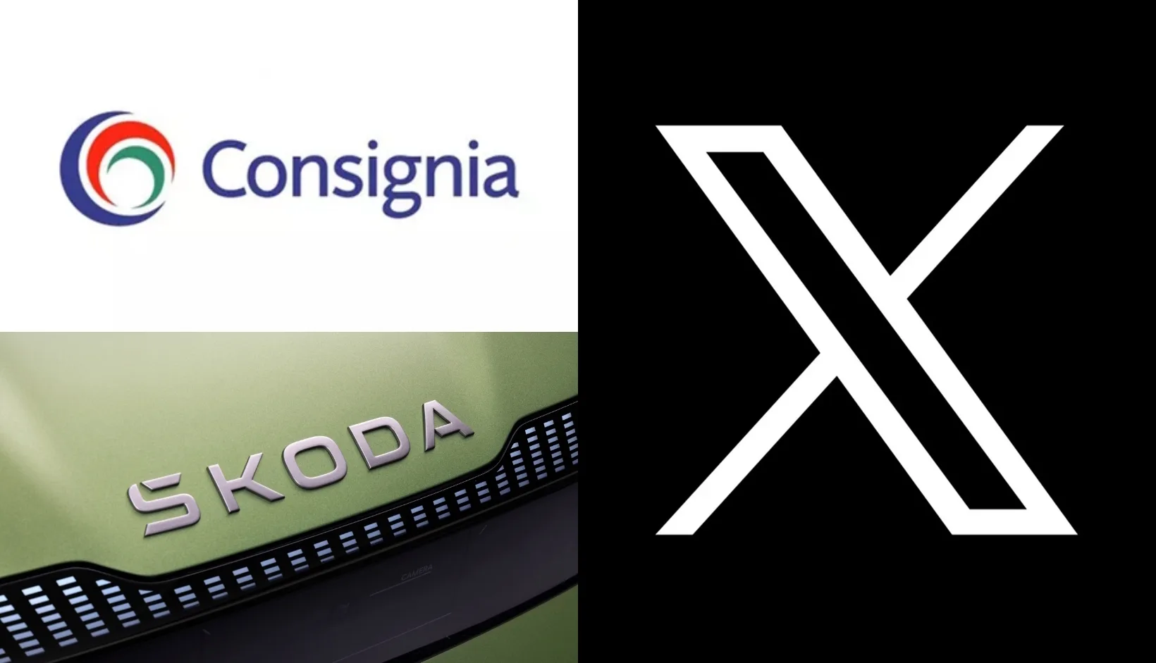
Take Royal Mail’s rebrand to Consignia (and back again) for example. If you’re of a certain age, you’ll remember the debut of this national fiasco in 2001. The UK postal service decided it was time to modernise and launched the name Consignia to position itself as a broader, more international brand. In the midst of public outcry, it was clear to see that people had a strong attachment to the old name and the heritage behind it (poor Postman Pat). Less than two years later, Royal Mail reverted to their original branding. Maybe the initial research wasn’t deep enough. We can’t know for sure, but it’s clear that a deeper understanding of their audience at the start could have saved a lot of headaches, and money.
Another rebrand that shook the nation (and the internet) was the infamous transformation of Twitter into X. Elon Musk’s decision to ditch the “bird” and the Twitter name in favour of a minimalistic letter ‘X’ still gets resistance to this day. The backlash was immediate, with many users preaching, “If it ain’t broke, don’t fix it.” Sources suggest there’s been a noticeable drop in the platform’s usage since Elon’s intervention. Either this was just simply a logo and name change, or there is still a grand plan waiting to unfold. We’ll all continue to watch this space.
However, for every Royal Mail hoo-ha and social media squabble, there’s a success story that shows us how rebranding can breathe life back into a business. When done thoughtfully and strategically, a rebrand can be a huge win. Remember when Škoda was the butt of all jokes? In the 1990s, it wasn’t exactly the car brand you’d write home about. Unveiled in 2022, Škoda’s rebrand was driven by their 2030 strategy, steering the Czech carmaker towards electrification and digitalisation, which has been reflected in their sleek, modern visual identity. It’s a textbook example of how a company can turn its reputation around, resulting in 866,800 vehicle sales in 2023, an 18.5% increase over the previous year.
Now, we’re not here to pass judgment, but when your rebrand hits the papers, you want it to be good. These are just a handful of examples showcasing how brand management demands meticulous attention. Before starting any branding process, you need to be sure of why you’re doing it and, through insight and research, know that it’s the right thing to do, as when done right, a rebrand can be transformational for any business.
REDEFINING THE WINE BAR
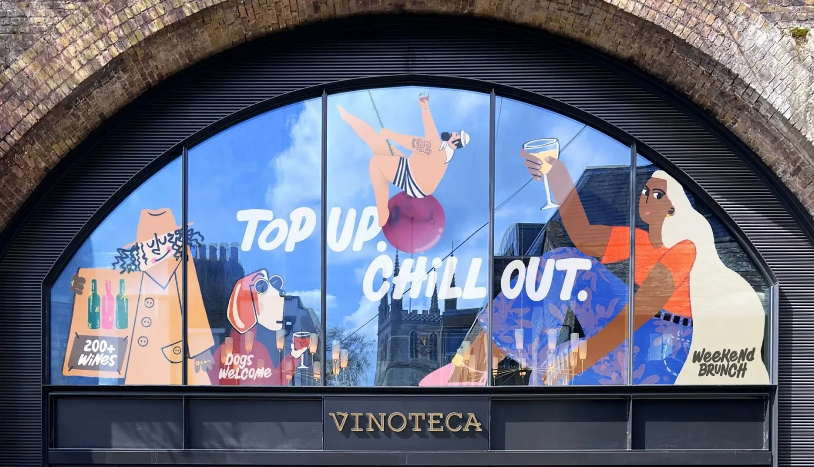
Speaking of successful rebrands (cue seamless segue), this week’s spotlight is on our Vinoteca rebrand—a wine bar on a mission to redefine connoisseur culture. With a challenge to open the brand’s doors to a wider audience, including casual drinkers, brunchers, lunchers, dog walkers and diners, the brand needed to challenge pretentious perceptions and make wine accessible to all.
Featuring a bold and approachable look and feel complimented by personality-packed hand-painted illustrations and a vibrant seasonal colour palette, the brand evolved into an inclusive platform for storytelling, introducing characters from all walks of life paired with a witty, wine-mad tone of voice with no wine-splaining.


